Monday, 2 December 2013

step 1 of monogram making


you know how every brand has their own style, logo, colours, or even symbols to represent their speciality. we would not want to see every designer brands with similar layout on how they present their brand do we? or even the simplest things, like restaurants or any companies. each and every merchandise out there have their own way of naming their brands. 

As for us, we were told to come up with a monogram that represents ourselves. monograms are similar to logos but for monograms, alphabets and fonts and also colours play a bigger role rather than having pictures as symbols. It is initials of names made into unique styles to represent one self. Simple, straightforward, and can be tricky at times. it takes more than just designing one, a lot of thinking and experimenting is needed in the process of coming up with a good monogram :) there are a few brands monograms that really wow people, how they arrange the alphabets together to form something so simple yet a whole lot of meanings to it.


the few examples of famous brands monograms : 


there are all so simple yet it shouts the brand's name in such a unique way :) 

I personally like fonts that like more edgy but at the same time has a twist (/curve, swirl?) to it. I was attracted to fonts that looked simple and also complicated at the same time. even reading what i have to explain is complicated isn't it? haha. for me, I have never tied myself down to just one thing, call me indecisive but I prefer to try new things and go through different obstacles in everything i do. I prefer not to stay to only one type of anything because at the end of the day I feel like even after creating a hundred different design of the same thing, it would all come down to the same thing at the end of the day. 

Back to how i prefer my fonts and alphabets and layouts, as i said during our class presentation, I like it simple and complicated at the same time :) even if it is complicated, it is obviously not a hundred strokes to it, just maybe some twist and turn around the corner to bring some character out of it? :) 

this below are the few fonts and design that catch my flu attention after flipping millions of pages in the library : 


see what i meant? edgy but with a little twist :) 


what i liked about this two were the colours combination
I loveeee colors, but i still come down to black & white depends on what I'm dealing with. hahha


this! was my personal favourite! 
i love love love the fonts of the "AVANT GARDE"
its so easy to read and yet it gives shape to the whole layout 


this one too! 
so edgy, me likey :) 
and also the up down effect going on there
even with motion and irregular shapes going on, it still looks simple 


the colour contrast is this is just too awesome i couldn't resist not liking it! 


hehe, i will update later on about my progress after knowing how i wanted my fonts to be like. 
I will tell you that the process in finding the right monogram for yourselves is a pain in the butt, but at the same time it is the excitement of finding what is right for yourselves and what screams "you" in just a small picture. it was difficult but one of the funniest assignment given. 

stay tune! xx

Tuesday, 5 November 2013

Exhibition

After all our paper cutting were done, we were all suppose to present it to Ms Lisa. 
But since the studio was in a mess by the other students, we were given a challenge in putting up our work as creative as possible. 
Someone from class had the craziest yet brilliant idea of having an exhibition in the middle of the walk way of Block E. And since it was in the middle, everyone could see our art work, boy were we proud! 

how we did the whole exhibition? 
we got chairs and tables, assemble them together 
and had everyone's work put in different level and space. 


 Just be posing with my work behind me hehe

 them being excited 

 Fariz and his insects ;) 


WE THE VIDEO! :) 
 a little shaky here and there but just watch it to see how it really was that day


Monday, 21 October 2013

paper cutting

For this assignment, we welcome back our paper cutting skills but this time with a little twist to it. 


let me ask you? 

WHAT IS A SQUARE? 

WHAT IS A SQUARE TO YOU? 

WHAT DO YOU THINK OF WHEN A SQUARE IS SHOWN?

IS A SQUARE JUST A SQUARE? 

CAN A SQUARE BE ANYTHING ELSE ? 


can it be a button? 


or a sunflower? 
or any flower... 


or even a square of jelly fish? 


a square of fingers? 


bubbles of squares? 


square in every kind of dimension? 


or is it just a plain square to you? 


or a sponge as a square? :) 


or maybe its a different shape of a square? 


SOUNDS DEEP HUH? 

...
I know. I was mindblown when were asked this question " what is a square? "
never really occur to me before that a square can be many things, many things actually comes from just a square itself. we could do so much just with a 5x6 piece of square paper and made it looked as if its not just a square. 


After much searching, I finally came up with an idea.
this is one of my very first sketches. 


any guess on what it is? 

.
.
.
.
.
.
.
.
.
.
.
.

YEAP! lanterns :) 

I got inspired by this pictures. initially, i actually was thinking about the cartoon movie, " Enchanted" and plus i wanted a theme that describes freedom, friendship, togetherness, and something bright.

I got my yellow paper ready 
started off with the trial version of the assignment just to get the hang of
the knife and also to see whether this theme would actually work for this "square assignment" 


see the bits and pieces of the cut out lantern parts? :) yeap I had to paste one by one o the little pieces outside of the small square paper.

And because our assignment had to have 1) symmetry and the other one 2) Asymmetrical. futhermore we had to use every single small little pieces that were cut out from the square, nothing was suppose to be left behind.

sounds like a lot of work? willllll, wait until you see how everything turn out ;)

As i got started with my first square, I cut out all the lantern patterns form the square and kept the small bits all together in a small jar incase if i loose any of it.


 this wasnt just it
there was more i tell you haha.


What do you think about the end product? :) 


I'll post up how we presented our assignment on the next post. 
it was amazing! 
so stay tune! :D 

Sunday, 29 September 2013

float


First Process : 

As announced, we were told to prepare for a floating exhibition on campus after much discussion with the whole class, we came to a agreement on lanterns and floating canvases. 

to make our lanterns we had were divided into 4 groups : chinese, malay, indian and minorities 
I joined the minority groups to feel "much at home" again. Since I haven had the east malaysian feel for a long time, i decided to do panterns of it to "feel" it again haha. 


this are the two first designs I came up with : 


and while in the process, I cut my finger :(


Ill post the other design stencils in my other post
 because I haven taken the pictures down for it yet. 

sooooooo... stay tuned AND BE EXCITEDDD  :) 

After managing all our stencils. we then assign ourselves into 3 groups : 

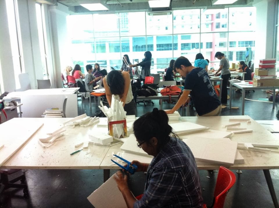
 cutting styrofoam, cardboards and also measuring cardboards.
this the making of our lanterns 


It was an experience of cutting styrofoams and also cardboards. the proper ways to handle the knifes and how to cut different kind materials. after all the cutting and the putting together of parts of the lanterns, i must say it was pretty successful :)

really cant wait for the exibition now! xx

Wednesday, 24 July 2013

Self portrait

SOOOOOOOO. Our semester 2 has began, pretty excited yetttt a little terrified to see what we have to face for this semester. 

As for our  first class of 2D design class, we were asked to come up with a self portrait describing ourselves, Again. BUT THIS TIME with a little twist ( of course). We not only had to come up with a self portrait of ourselves.. we had to be creative and use materials ( leaves, stones , wood, branches, water... etc ) to built our self portrait. 

it sounds exciting? yeap it is, but a little challenging too since there was not much material that could be found on campus except for rocks/stones, duck/ goose feathers, leaves, grass, mud. And me wanting to be different, I had to think of other materials that most people would not think of using. I did not want to have something common, but yet still explains the same meaning to what i have to say about myself. 

After much thoughts, i finally thought of BALLLOOOONS. I initially wanted feathers or something light yet to go with my freedom concept. And then i thought harder. 

The description for my self portrait was : I am who I am, i do not like anything/ anyone that is fake. I find myself difficult to face unreal statements around me. once I cant put myself in liking a certain someone/ something I would not fake myself in liking it. In short, I'm not a two face kind of person. Also, I like to be free and not be under any control of anything/ anyone. I like to be able to move about and do what i like --- ( can be a rebel when I have restrictions ) 

and soooooo, my idea of a balloon came about :) 


I was so worried on whether i could actually find balloons on campus. I tried asking around but no one knew where to get em. and finally when the stationary shop on campus opens, i was the first one dashing in looking for balloons. and of course i jump for joy when i found them :DDD

I created a balloon image of me.  Gave it eyes, nose and mouth and even made strips of hair out of paper and some tape  to give it some volume to my "sculpture"


I had fun :)