Monday, 23 December 2013

Painting to music


This first painting that was painted to modern/recent-played/mainstream music
I wasn't sure at first , what I should put down on the canvas 
I didn't know which color to use, what objects to paint, which strokes of brush to put on the canvas 
After awhile, I thought, since the music played were "in" "now" music, I thought why not paint ME. 
Not exactly me, but mostly of how I felt then. 

I was having a pretty bad day that day. Was not feeling very well, and was feeling pretty stressed out by many personal reasons. And thought this colors used were all slightly gloomy, bright but yet not so bright . And  the brush strokes are slightly incomplete  and in a mess due to the incomplete mindset I was having. Since my mind was in a mess  and I was feeling a little down,  I thought purple suit my skin tone and to add the whole emotional environment, I had my eyes closed in this painting . 


This second painting is a little more lively compared to the first one 
The colors I used are a little brighter  
We had classical music played to this second painting 


I decided to bring a little more live for the second  painting      
A little sense of letting go, since I was feeling down earlier I decided to let all the sadness go in this painting  with a little more colors and with the leaves flowing down- sight of letting go :)


Saturday, 21 December 2013

Batik printing


We had our batik trip a few weeks back and it was a fun experience. 
I was really looking forward  since I have never tried batik printing before. 
For my group, me Maegan ,  Fariz and Nic were once again in the same group :) 
For this assignment, we decided to  do "Real Life Super Heroes" as our theme


Fariz choose to me the Malaysian  Mail Men  hence the orange  uniform with a little spice of superhero dress up look :)

I'm suppose to be baker girl ! Since baker girl sounds like a girly character, I decided to have it colored pink. And also a nice beg as my hat

Nicholas is fireman. Since firemen in Malaysia are dressed in orange uniforms. Too, Nic had no choice but to have his character in orange too  but to differentiate his from Fariz, he had a different head gear on and also a different background

Last bad not least, Maegan was sexy Policewomen.  Since Malaysian doesn't have much policewomen around, she decided to step in and show that women can be as sexy in a police uniform than men! Haha


Sunday, 8 December 2013

monogram outcome


After much head-scratching decisions, and a lot of sketching and research of fonts, colours, shapes and different type of other monograms, i finally got my very own monogram finalised. who knew after so many tries, and many complicated sketches, I ended up with one of the monogram which i did not expect choosing. It was one of those sketches being randomly drawn and not looked at for the second time, and after I finalised it, I actually was really satisfied with the decision Ms Lisa had made for me :) without her noticing this monogram, it would not have cross my mind in choosing it, and I'm glad i ended up with this  specific one 


second stage of monogram making : stencil cutting. 

I was lucky enough to have my monogram being so simple, that way I did not need to go through so much cutting. I didn't mind the cutting, but to have to cut out different sizes and different parts of it countable times, I would have gone mad if it was more than two parts. haha.


This was the stage when I had to choose what colour was suitable for my monogram. 
at the end of it, I came down with black as the main colour and gold being the middle to show the "SJ" initials. 

Stage 3: choosing 6 items to print my monogram on 


the first few objects that i chose were : 

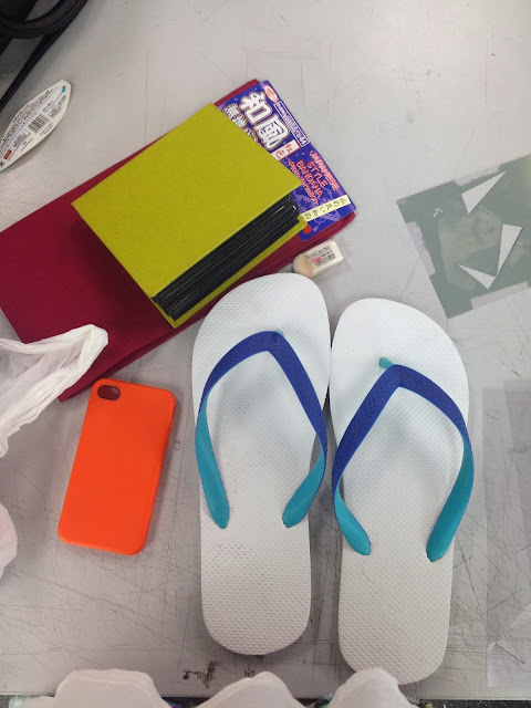
slippers 
iPhone cover 
photo book cover 
bandana 
laptop cover 


but after going through the whole process and discovering a few difficulties in printing my monogram on certain objects ( paint would not stay, not so interesting objects... etc ) I changed a few of my objects to : 

slippers
iPhone cover 
photo book cover 
notebook cover 
laptop cover 
pencilbox 
socks 

and because I got myself fabric paint, I decided to print more of my monograms on fabric based objects, did not want my paint to go to waste. 


as for the slippers, I had it sprayed with spray paint first and then 
some touch up with paint just to clean the sides of the monogram and the surroundings of the slippers. the spray paint splatters a little, it would not be too pleasing to see dirty marks all over my slipper :( what more it was a white slipper. 


 final outcome of the slipper :D 

sadly I could not bring it in on presentation day
because i had it lent to my one of friend, and because of it being white, it got a little dirty :( 
and also because my friend did not return it back. at least I still have a picture of it :) 


As for the other objects which I did in class, 
was my very own personal photo book, my monogram print came out quite pleasing 
I love the combination of the colour, how it pop and also how neat it came out :) 

but as for the bandana, I did not know exactly how to make it more interesting, whether to have my monogram printed all around it ( which i tried) r just had it end with just one big monogram in the middle. and because how i placed all the different sizes of monogram prints on it, I felt that it was kind of too messy. hence I did not bring it into class for presentation. 

I went home and continue on searching for more objects for me to print on.
I found socks, which I've not worn yet, and decided why not? to have my own initials on my own socks? seems pretty cool. and it came out pretty good :) 


yes? :) 

next was a note book that i found in my room, 
I used to have a really bad habit on buying note books ( they are so pretty and some even have really cute covers. how can i not?! haha )  and ended up not using them.. since this notebook that i got, was rather plan on the in front, I decided to spice it up a little to make it look more "mine" hehe.

and also the iPhone cover. I previously wanted to do on my orange iPhone casing, but because of how it is made of rubber, and I tried spray painting it, it did not last. so I went back and found this fabric-like iPhone casing that I haven used in a long time. 


stage 4 : presenting our work :) 


what do you guys think?
yay or nay? :) 

I personally thought it turned out really nice. Especially how I used all kind of different colour to print my monogram on, which shows that my monogram is able to easily blend in most colours ( expect for black of course ) and also most of the objects that i choose are personal objects which I use most of the time, gives more meaning to my monogram hehe 


next post will be exciting! 
BATIK MAKING :D 


xx

Monday, 2 December 2013

step 1 of monogram making


you know how every brand has their own style, logo, colours, or even symbols to represent their speciality. we would not want to see every designer brands with similar layout on how they present their brand do we? or even the simplest things, like restaurants or any companies. each and every merchandise out there have their own way of naming their brands. 

As for us, we were told to come up with a monogram that represents ourselves. monograms are similar to logos but for monograms, alphabets and fonts and also colours play a bigger role rather than having pictures as symbols. It is initials of names made into unique styles to represent one self. Simple, straightforward, and can be tricky at times. it takes more than just designing one, a lot of thinking and experimenting is needed in the process of coming up with a good monogram :) there are a few brands monograms that really wow people, how they arrange the alphabets together to form something so simple yet a whole lot of meanings to it.


the few examples of famous brands monograms : 


there are all so simple yet it shouts the brand's name in such a unique way :) 

I personally like fonts that like more edgy but at the same time has a twist (/curve, swirl?) to it. I was attracted to fonts that looked simple and also complicated at the same time. even reading what i have to explain is complicated isn't it? haha. for me, I have never tied myself down to just one thing, call me indecisive but I prefer to try new things and go through different obstacles in everything i do. I prefer not to stay to only one type of anything because at the end of the day I feel like even after creating a hundred different design of the same thing, it would all come down to the same thing at the end of the day. 

Back to how i prefer my fonts and alphabets and layouts, as i said during our class presentation, I like it simple and complicated at the same time :) even if it is complicated, it is obviously not a hundred strokes to it, just maybe some twist and turn around the corner to bring some character out of it? :) 

this below are the few fonts and design that catch my flu attention after flipping millions of pages in the library : 


see what i meant? edgy but with a little twist :) 


what i liked about this two were the colours combination
I loveeee colors, but i still come down to black & white depends on what I'm dealing with. hahha


this! was my personal favourite! 
i love love love the fonts of the "AVANT GARDE"
its so easy to read and yet it gives shape to the whole layout 


this one too! 
so edgy, me likey :) 
and also the up down effect going on there
even with motion and irregular shapes going on, it still looks simple 


the colour contrast is this is just too awesome i couldn't resist not liking it! 


hehe, i will update later on about my progress after knowing how i wanted my fonts to be like. 
I will tell you that the process in finding the right monogram for yourselves is a pain in the butt, but at the same time it is the excitement of finding what is right for yourselves and what screams "you" in just a small picture. it was difficult but one of the funniest assignment given. 

stay tune! xx

Tuesday, 5 November 2013

Exhibition

After all our paper cutting were done, we were all suppose to present it to Ms Lisa. 
But since the studio was in a mess by the other students, we were given a challenge in putting up our work as creative as possible. 
Someone from class had the craziest yet brilliant idea of having an exhibition in the middle of the walk way of Block E. And since it was in the middle, everyone could see our art work, boy were we proud! 

how we did the whole exhibition? 
we got chairs and tables, assemble them together 
and had everyone's work put in different level and space. 


 Just be posing with my work behind me hehe

 them being excited 

 Fariz and his insects ;) 


WE THE VIDEO! :) 
 a little shaky here and there but just watch it to see how it really was that day